Bootstrap sample


Header font is specified in h1, h2... selector in css file.
  <h1>h1 header  <small class="text-muted">muted subtitle1</small></h1>
  <h2>h2 header  <small class="text-muted">muted subtitle2</small></h2>
  <h3>h3 header  <small class="text-muted">muted subtitle3</small></h3>
  <h4>h4 header  <small class="text-muted">muted subtitle4</small></h4>
  <h5>h5 header  <small class="text-muted">muted subtitle5</small></h5>
  <h6>h6 header  <small class="text-muted">muted subtitle6</small></h6>
  h1, h2, h3, h4, h5, h6 {
    color: #000;
  /*  font-family: "Playfair Display", serif;*/
    font-family: "Roboto", sans-serif;
    line-height: 1.2;
  }

  h1, .h1 {
    font-size: 80px;
  }
Use .display-1~4 for bigger header
  <h1 class="display-1">display 1</h1>
  <h1 class="display-2">display 2</h1>
  <h1 class="display-3">display 3</h1>
  <h1 class="display-4">display 4</h1>
For paragraph, use <p> tag. .lead is for a summary of the article.
My work for this week
I worked on xxx for this week and enjoyed making...
  <p class="lead">My work for this week</p>
  <p>I worked on xxx for this week and enjoyed making... </p>
<mark>, <del> etc. define inline text format.
mark defines marked/heighlight text.
del defines deleted text.
s defines text that is no longer correct.
ins defines inserted text.
u defines underlined text.
small defines small text.
strong defines important text.
em defines emphasized text.
  <p><code>mark</code> defines <mark>marked/heighlight text</mark>.</p>
  <p><code>del</code> defines <del>deleted text</del>.</p>
  <p><code>s</code> defines <s>text that is no longer correct</s>.</p>
  <p><code>ins</code> defines <ins>inserted text</ins>.</p>
  <p><code>u</code> defines <u>underlined text</u>. </p>
  <p><code>small</code> defines <small>small text</small>. </p>
  <p><code>strong</code> defines <strong>important text</strong>.</p>
  <p><code>em</code> defines <em>emphasized text</em>.</p>
.text-primary, .text-success etc. defines text colors based on context
  <div class="text-primary">.text-primary</div>
  <div class="text-secondary">.text-secondary</div>
  <div class="text-success">.text-success</div>
  <div class="text-danger">.text-danger</div>
  <div class="text-warning">.text-warning</div>
  <div class="text-info">.text-info</div>
  <div class="text-light bg-dark">.text-light</div>
  <div class="text-dark">.text-dark</div>
  <div class="text-body">.text-body</div>
  <div class="text-muted">.text-muted</div>
  <div class="text-white bg-dark">.text-white</div>
  <div class="text-black-50">.text-black-50</div>
  <div class="text-white-50 bg-dark">.text-white-50</div>
.bg-primary, .bg-success etc. defines background colors based on context
  <div class="p-1 mb-1 bg-primary text-white">.bg-primary</div>
  <div class="p-1 mb-1 bg-secondary text-white">.bg-secondary</div>
  <div class="p-1 mb-1 bg-success text-white">.bg-success</div>
  <div class="p-1 mb-1 bg-danger text-white">.bg-danger</div>
  <div class="p-1 mb-1 bg-warning text-dark">.bg-warning</div>
  <div class="p-1 mb-1 bg-info text-white">.bg-info</div>
  <div class="p-1 mb-1 bg-light text-dark">.bg-light</div>
  <div class="p-1 mb-1 bg-dark text-white">.bg-dark</div>
  <div class="p-1 mb-1 bg-white text-dark">.bg-white</div>
  <div class="p-1 mb-1 bg-transparent text-dark">.bg-transparent</div>
<code> defines inline code.
This is sample inline code git log --oneline --decorate in gitbash.
<p>This is sample inline code <code class="bg-gray">git log --oneline --decorate</code> in gitbash.</p>
<pre> defines code block by pre-formatted multiple lines.
  void setup() {
    pinMode(LED_BUILTIN, OUTPUT);
  }

  void loop() {
    digitalWrite(LED_BUILTIN, HIGH);
    delay(1000);
    digitalWrite(LED_BUILTIN, LOW);
    delay(1000);
  }
  <pre class="my-block">
  void setup() {
    pinMode(LED_BUILTIN, OUTPUT);
  }

  void loop() {
    digitalWrite(LED_BUILTIN, HIGH);
    delay(1000);
    digitalWrite(LED_BUILTIN, LOW);
    delay(1000);
  }</pre>
<var> defines variant.
E = mc2
<p><var>E</var> = <var>m</var><var>c</var><sup>2</sup></p>
<kbd> defines user input.
You can terminate console window by ctrl + c.
<p>You can terminate console window by <kbd>ctrl + c</kbd>.</p>
<samp> defines sample output.
bash: pyupdi: command not found
<p><samp>bash: pyupdi: command not found</samp></p>
.table class defines standard table at Bootstrap.
| parts | description | amount |
|---|---|---|
| micro controller | ATtiny1614 | 1 |
| capacitor | 1uF | 1 |
| pin header for FTDI | 1x6 pin | 1 |
| pin header for UPDI | 1x2 pin | 1 |
  <table class="table">
    <caption>ATtiny1614 echo board</caption>
    <tr><th>parts</th><th>description</th><th>amount</th></tr>
    <tr><td>micro controller</td><td>ATtiny1614</td><td>1</td></tr>
    <tr><td>capacitor</td><td>1uF</td><td>1</td></tr>
    <tr><td>pin header for FTDI</td><td>1x6 pin</td><td>1</td></tr>
    <tr><td>pin header for UPDI</td><td>1x2 pin</td><td>1</td></tr>
  </table>
.thead-light defines light-gray header.
.table-bordered defines border lines between cells.
| parts | description | amount |
|---|---|---|
| micro controller | ATtiny1614 | 1 |
| capacitor | 1uF | 1 |
| pin header for FTDI | 1x6 pin | 1 |
| pin header for UPDI | 1x2 pin | 1 |
  <table class="table table-bordered">
    <thead class="thead-light">
      <tr><th>parts</th><th>description</th><th>amount</th></tr>
    </thead>
    <tr><td>micro controller</td><td>ATtiny1614</td><td>1</td></tr>
    <tr><td>capacitor</td><td>1uF</td><td>1</td></tr>
    <tr><td>pin header for FTDI</td><td>1x6 pin</td><td>1</td></tr>
    <tr><td>pin header for UPDI</td><td>1x2 pin</td><td>1</td></tr>
  </table>
.table-active, .table-warning etc. in <tr>, <th>, <td> defines background color.
.table-sm defines border lines between cells.
| Class | Description |
|---|---|
| .active | This is a active message. |
| .primary | This is a primary message. |
| .secondary | This is a secondary message. |
| .success | This is a success message. |
| .danger | This is a danger message. |
| .warning | This is a warning message. |
| .info | This is a information message. |
| .light | This is a light message. |
| .dark | This is a dark message. |
  <table class="table table-sm">
    <tr><th>Class</th><th>Description</th></tr>
    <tr class="table-active"><td>.active</td><td>This is a active message.</td></tr>
    <tr class="table-primary"><td>.primary</td><td>This is a primary message.</td></tr>
    <tr class="table-secondary"><td>.secondary</td><td>This is a secondary message.</td></tr>
    <tr class="table-success"><td>.success</td><td>This is a success message.</td></tr>
    <tr class="table-danger"><td>.danger</td><td>This is a danger message.</td></tr>
    <tr class="table-warning"><td>.warning</td><td>This is a warning message.</td></tr>
    <tr class="table-info"><td>.info</td><td>This is a information message.</td></tr>
    <tr class="table-light"><td>.light</td><td>This is a light message.</td></tr>
    <tr class="table-dark"><td>.dark</td><td>This is a dark message.</td></tr>
  </table>
.row defines one row .col defines one column. Total(max) # of column is 12.
  <div class="container-fluid">
    <div class="row">
      <div class="col my-box">Grid A</div>
      <div class="col my-box">Grid B</div>
    </div>
    <div class="row">
      <div class="col my-box">Grid C</div>
      <div class="col my-box">Grid D</div>
      <div class="col my-box">Grid E</div>
    </div>
  </div>
.col-{n} defines the size(width) of column in 12 columns/row in total. If a summary in the size of columns exceeds 12, extra grid goes to next row automatically.
  <div class="container-fluid">
    <div class="row">
      <div class="col-6 my-box">Grid A(6)</div>
      <div class="col-3 my-box">Grid B(3)</div>
      <div class="col-3 my-box">Grid C(3)</div>
    </div>
    <div class="row">
      <div class="col-6 my-box">Grid D(6)</div>
      <div class="col-4 my-box">Grid E(4)</div>
      <div class="col-4 my-box">Grid F(4)</div>
    </div>
  </div>
Defining .col-{breakpoint}-{n}, you can change the columns allocation by the size of device screen. Breakpoints are listed as below:
.col : xs: Extra small phones(~575px).col-sm- : xm:Smart phones(576~767px).col-md- : md:Tablet(768~991px).col-lg- : lg:Middle sized display(992~1199px).col-xl- : xl:Large sized display(1200px~)As below, for phone defines 6:6 +(6:6 at the next row) and for devices bigger than Tablet defines 3:3:3:3
  <div class="container-fluid">
    <div class="row">
      <div class="col-sm-6 col-md-3 my-box">Grid A</div>
      <div class="col-sm-6 col-md-3 my-box">Grid B</div>
      <div class="col-sm-6 col-md-3 my-box">Grid C</div>
      <div class="col-sm-6 col-md-3 my-box">Grid D</div>
    </div>
  </div>
.img-fluid defines the responsive image that changes the size of width by screen width.
<img src="images/portfolio/item-8_1024x.jpg" class="img-fluid">
If not specifying .img-fluid, image is displayed in the original size and user may not be able to see the entire like:
<img src="images/portfolio/item-8_1024x.jpg">
.img-thumbnail defines a .25rem boarder line for image

<img src="images/portfolio/item-3.png" class="img-thumbnail">
.float-{left|right|none} controls the text wrapping on image.
  <div class="clearfix mb-2">
    <div class="float-left"><img src="..."></div>
    This is a message...
  </div>
  <div class="clearfix mb-2">
    <div class="float-right"><img src="..."></div>
    This is a message...
  </div>
  <div class="clearfix">
    <div class="float-none"><img src="..."></div>
    This is a message...
  </div>
Using Grid(row, col) and .img-fluid, image and sentences can be positioned in grid system. Check how position is changed adaptively on changing the width of browser or your device.
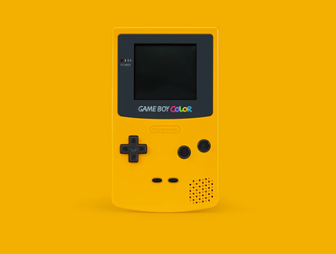
Grid A(6)
Grid B(3)
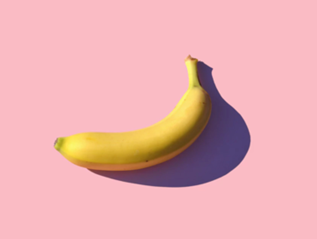
I found a watch.
Grid C(3)
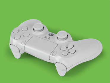
I play the video game.
Grid D(4)
Grid E(2)
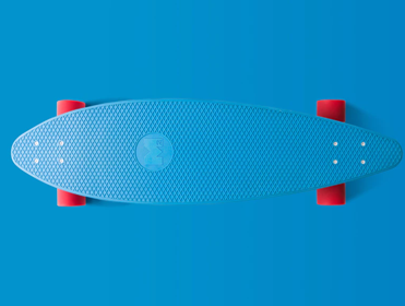
I cannot ride skate board...
Grid F(4)
Grid G(2)
Let's take a photo for your work!
  <div class="container-fluid">
    <div class="row">
      <div class="col-sm-6">
        <img src="images/portfolio/item-2.png" class="img-fluid">
        <p>Grid A(6)</p>
      </div>
      <div class="col-sm-3">
        <img src="images/portfolio/item-3.png" class="img-fluid">
        <p>Grid B(3)<br>
        I found a watch.</p>
      </div>
      <div class="col-sm-3">
        <img src="images/portfolio/item-4.png" class="img-fluid">
        <p>Grid C(3)<br>
        I play the video game.</p>
      </div>
    </div>
    <div class="row">
      <div class="col-sm-4">
        <img src="images/portfolio/item-5.png" class="img-fluid">
        <p>Grid D(4)</p>
      </div>
      <div class="col-sm-2">
        <p>Grid E(2)<br>
        I cannot ride skate board...</p>
        <p></p>
      </div>
      <div class="col-sm-4">
        <img src="images/portfolio/item-7.png" class="img-fluid">
        <p>Grid F(4)</p>
      </div>
      <div class="col-sm-2">
        <p>Grid G(2)<br>
        Let's take a photo for your work!</p>
      </div>
    </div>
  </div>
  <div class="alert alert-primary" role="alert">Primary alert</div>
  <div class="alert alert-secondary" role="alert">Secondary alert</div>
  <div class="alert alert-success" role="alert">Success alert</div>
  <div class="alert alert-danger" role="alert">Danger alert</div>
  <div class="alert alert-warning" role="alert">Warning alert;</div>
  <div class="alert alert-info" role="alert">Info alert</div>
  <div class="alert alert-light" role="alert">Light alert</div>
  <div class="alert alert-dark" role="alert">Dark alert</div>
LED blinked successfully...
  <div class="alert alert-success" role="alert">
    <h4 class="alert-heading">Success!</h4>
    <p>LED blinked successfully...</p>
  </div>